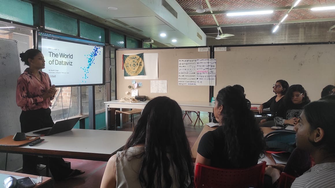
I distinctly remember the day I discovered information design as a field. I can recall every neuron in my brain lighting up—the kind of feeling you get when you enter flow state. I've always grappled with the fact that I am truly a generalist, but information design seemed to reward those with range. It is a field that requires one to be curious, ask questions, perform research, architect information, intuitively visualise data, and communicate insights. And given my career has spanned science, communications, and design over 8+ years, my hodgepodge of a skillset ticked these boxes. It didn't take me long to proclaim to the universe that this was the field I wanted to set up camp in.
However, information design is still in its nascency in India. Landing a purely information design-only role can be close to impossible. That's why I don't take it for granted that a few months after my proclamation, I chanced upon an opening for a designer at a brand new Indian information design agency—Revisual Labs. What made it all the more better was that it was founded by Gurman Bhatia, an information design leader whose data stories I deeply admired. The job description was completely aligned with my goals at the time, and even though it requested a short email, I sent them a long(ish) one. Two weeks later, on 2nd October 2023, I started my Monday morning being added to Revisual Labs' Slack. And set up camp, I did.
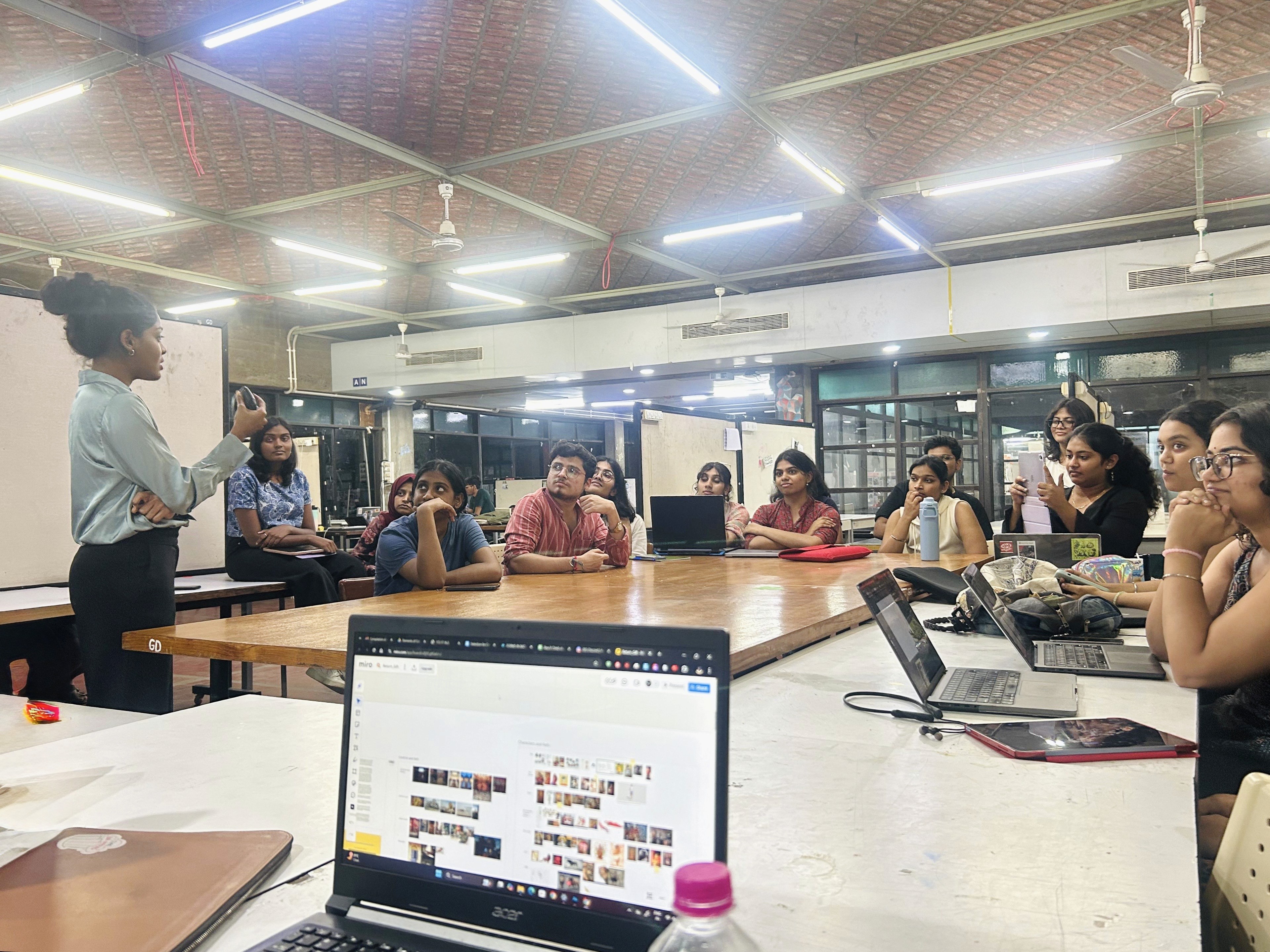
Two years later, in September 2025, I had the privilege of introducing 22 B.Des. Graphic Design students to the world of information design at the National Institute of Design (NID), Ahmedabad.
Here are some reflections from two weeks of my time as visiting faculty:
Graphic design students are predisposed to being good information designers
On day 1, I conducted a short "encoding drawing" session, inspired by one that Gurman once ran at our studio. It presented the students with a very simple dataset:
Number of parental leaves given per year (in days)
Country | Men | Women |
|---|---|---|
Albania | 15 | 60 |
Netherlands | 20 | 90 |
My ask to the students was simple—spend 5 minutes on pen and paper sketching as many ways as they could think of visualising these numbers. Even though the majority of my batch stated that they hadn't engaged with or made a lot of charts before, the visualisations they whipped up were incredibly intuitive. Many of them ended up making quintessential charts, unbeknownst to them that these were actual chart types. This was a great litmus test—it let me engage with them over the next few days with a lot more rigour and confidence.
On day 2, after a session on data structures and visual encoding, we attempted a slightly more elevated exercise. The batch was split into groups and they were requested to visualise this dataset by choosing the best possible visual encodings:
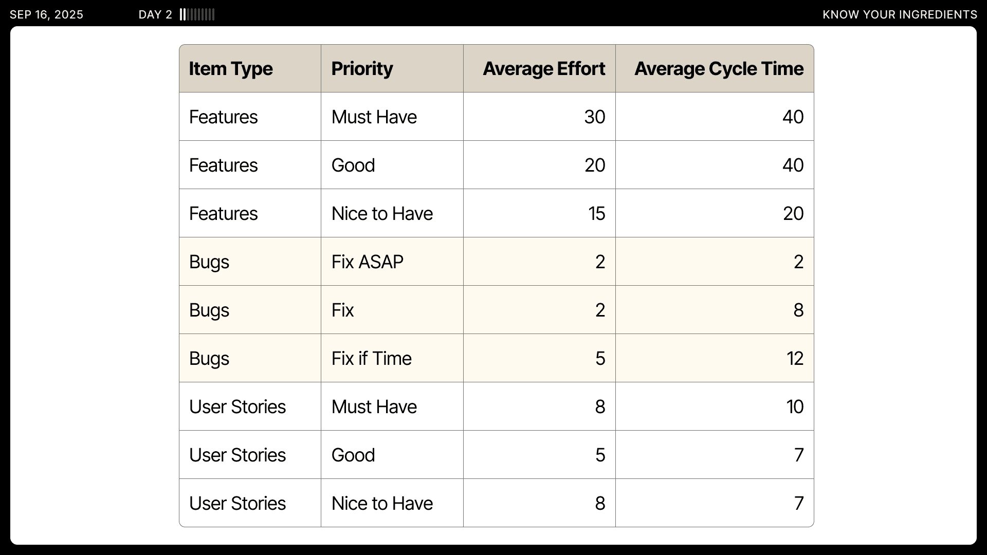
They were requested to not use AI assistance or look up visual references on the internet. Here are some of their outputs at the end of 30 minutes:
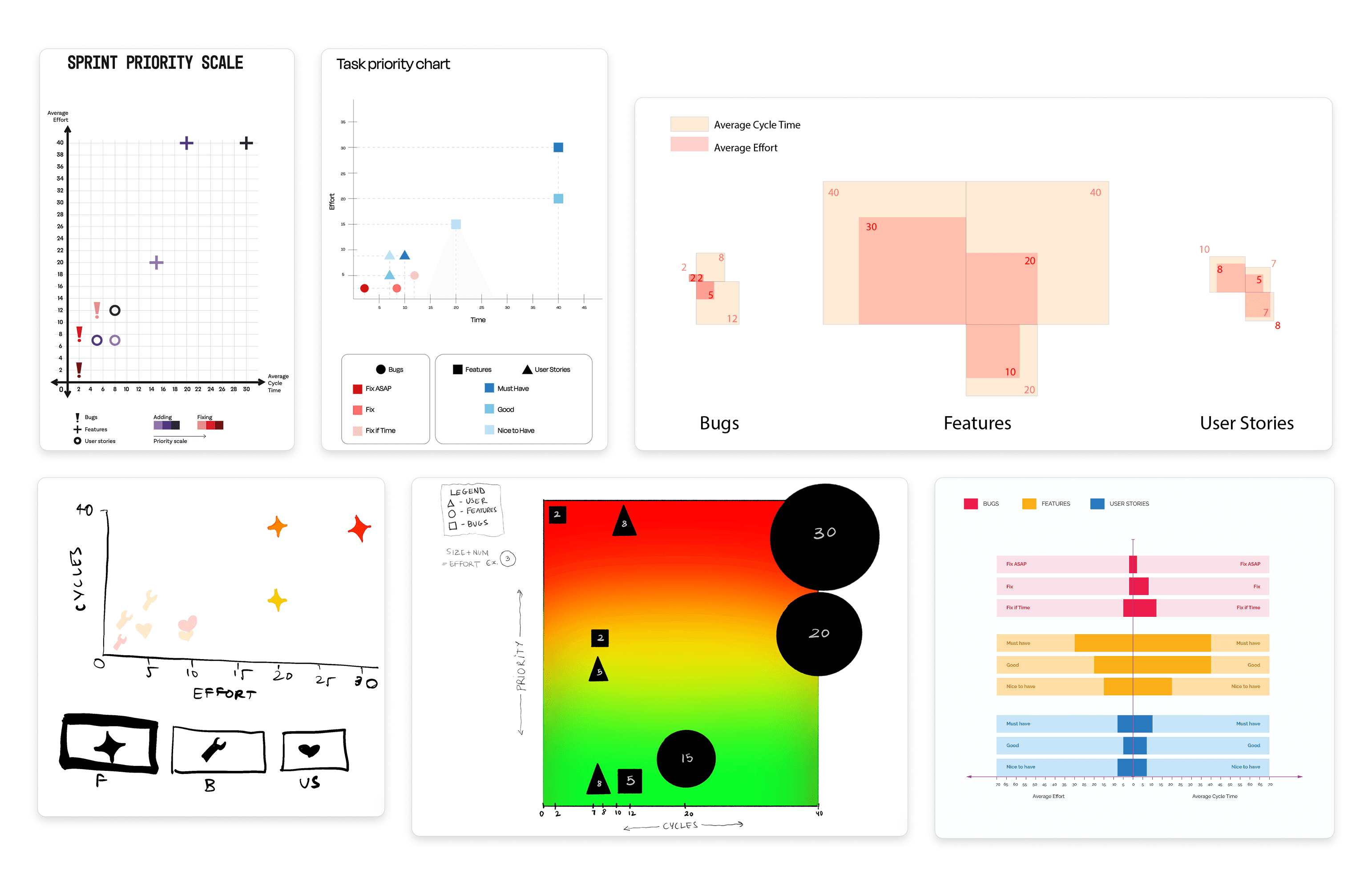
We did a show-and-tell, critiquing all groups' visualisations to understand what worked well and which redundancies could be eliminated. But overall, they did a fantastic job! As graphic designers, their foundational understanding of space, layout, Gestalt principles, and colour all translate incredibly well into information design.
Design students are VERY keen on learning non-design tools as well
While preparing to teach this course, I faced a serious conundrum—which tool do I introduce the students to for data wrangling? Using spreadsheet tools was out of the question—it would've been too difficult to trace their workflows and troubleshoot, given these tools modify the original dataset and do not document any pipelines. R would've been too complicated given it is a code-based tool, and nor am I an R expert. I needed to use a tool that'd be intuitive, easy to pick up, traceable, and open-source.
At the suggestion of my incredible colleague Aman Bhargava, I chose to use Orange Data Mining to teach my students how to wrangle data and create summary statistics. Orange bridged all the gaps I was concerned about. Given it is a visual programming software, it maps out all workflows and pipelines (which would help me troubleshoot problems), and it does not modify the original dataset, but simply transforms it throughout a workflow.
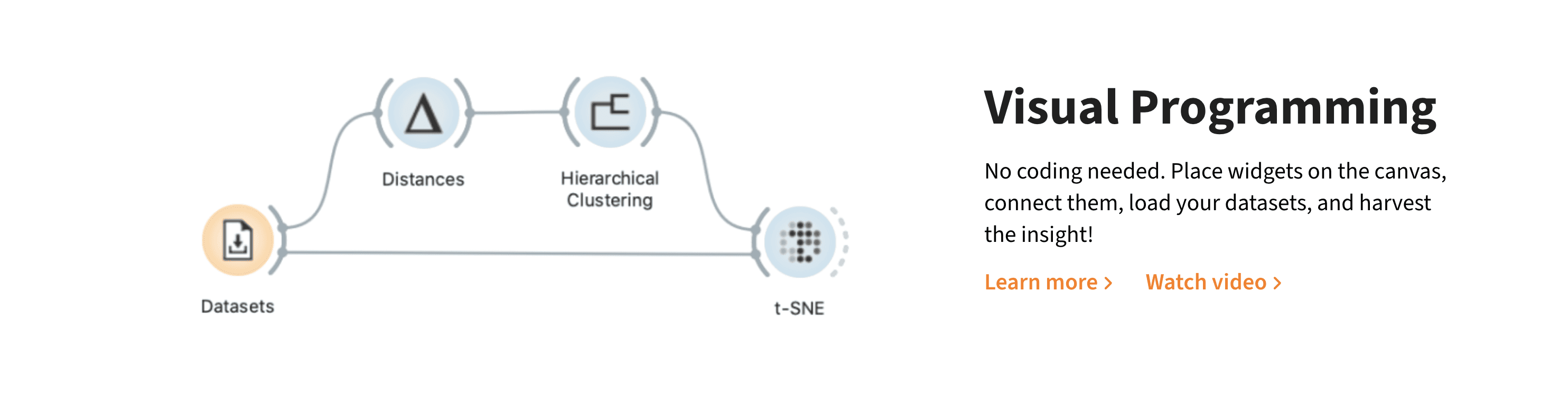
I could go on and on about the tool (I'm planning on writing a dedicated post soon!), but let me circle back. Now that I had my choice of tool, new questions made me nervous—would they find the tool boring? Would they disregard its importance? Scratch that, would they even care about data wrangling and summary statistics in the first place?!
But on day 3, they left me stunned. Our curriculum for the day included:
Why create data summaries?
Calculating basic statistics to create summaries
Introduction to Orange
Demo 1: Heart disease dataset to create a simple summary
Demo 2: Iris dataset to demonstrate more Orange operations
Self-led activity: Penguins dataset
Examine data
Ask research questions
Create a data summary
Arrive at a simple story
Exercise: Practice worksheet (Scooby-Doo dataset) | Credits: Aman Bhargava
After completing the exercise, I requested them to break for lunch at 1:30 pm. Much to my surprise, none of them left voluntarily. They were so engrossed by this new tool they were learning, that they wanted to figure out every single operation possible. They wanted to create more visualisations. They wanted to establish more correlations. They wanted to add more widgets; link them with more nodes. They wanted to create many more summary statistics, given the Scooby-Doo dataset was quite extensive. They wanted to stay and figure out this tool and all its nitty-gritties!
I did NOT expect such positive and instant tool adoption. It goes to show that students like to take up a challenge, even if the tool is from a domain that is far removed from theirs and has little implication on their design practice. But this is what delighted me most about their time using Orange over the next few days: Each of their thought processes were uniquely mapped out on the canvas by how they chose to arrange widgets and nodes. It was almost like a self-portrait of how each of their brains functioned. Some of them were pedantic and clean; some were messy yet ambitious; some had way too many checkpoints to verify their data tables after performing a function; and some were laid out the way they because, well, they looked pretty!
Here's what the Orange canvas of one of my student groups (Apurva Rouduri, Gauri Bandewar, Tiya Wagh, and Manuel K Mathew) looked like at the end of their course project:
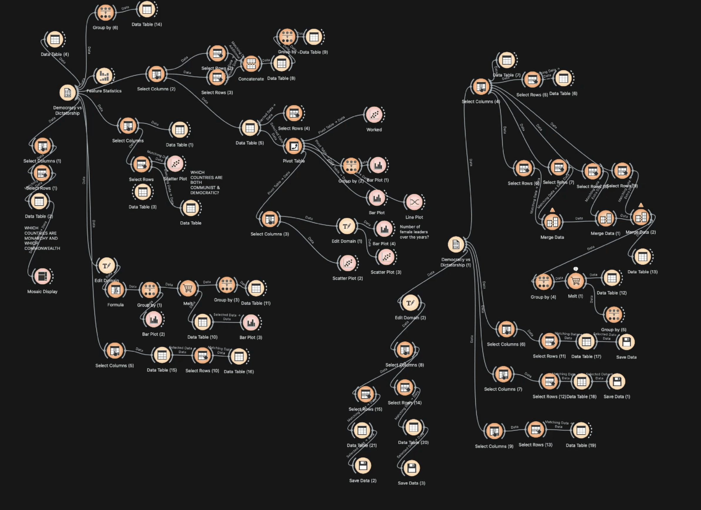
Towards the end of the course, the students were so adept at using Orange that they could very well have taught their peers. They learned how to read and understand feature statistics, pivot tables, edit domains, merge data tables, "group by" to aggregate data and create summary stats, and create visualisations + export them as SVGs for further styling. Their interest and willingness to learn Orange was one of my biggest highlights from this teaching experience.
Students learn best while working with data they care about
Yet another daunting question that taunted me during course prep—why would the students care about data in the first place? Luckily for me, VizChitra (India's data visualisation community and conference) exists, which my team at Revisual Labs co-founded. My saving grace was a sub-group named Educators of VizChitra, where Ipsa Jain (an incredible science communicator) shared this message a couple of weeks before my visit to NID:
"At a Birds of a Feather session at VizChitra 2025, one young teacher emphasised how before diving into design or data itself, what truly matters is establishing why data or data visualization is worth caring about at all, while also acknowledging that students often ask about industry applications early on, which isn’t always the best entry point. There was an emphasis on getting students to choose datasets they personally care about rather than giving them arbitrary data, and teaching them to think about the story behind the data."
The point about getting students to choose datasets struck a chord with me, and sure enough, I did see this manifest.
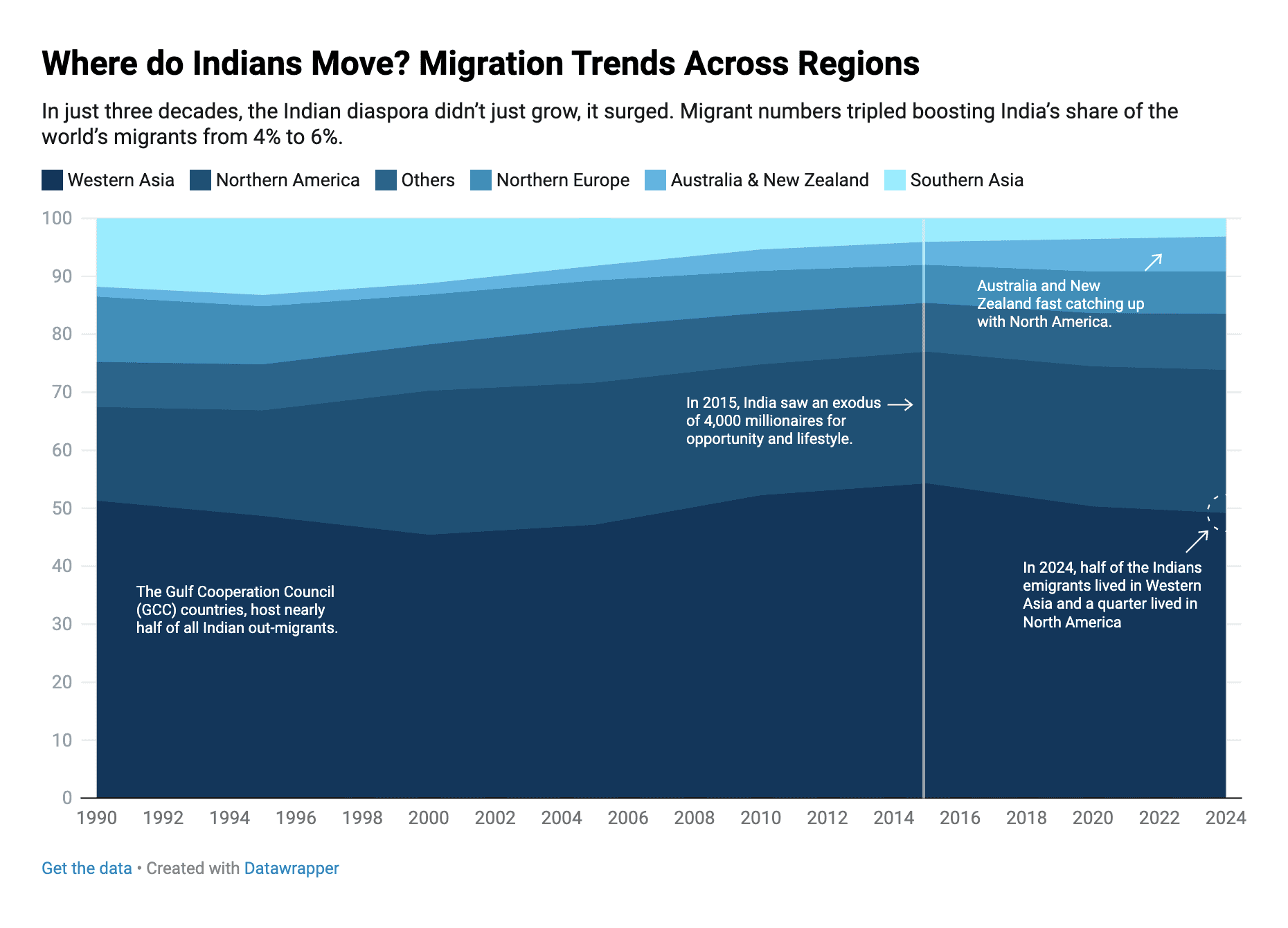
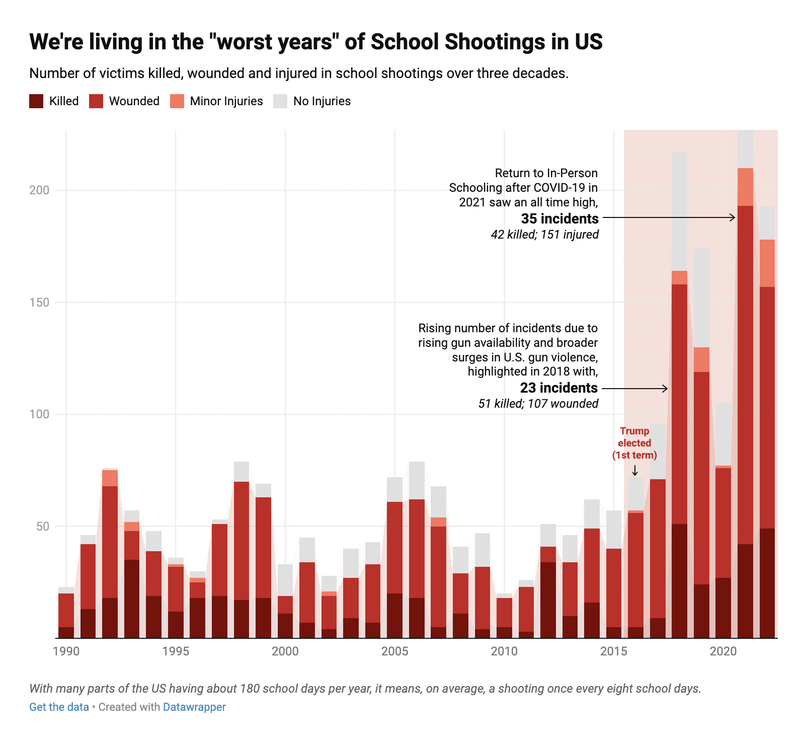
While our early activities with Orange and our session on "asking questions of your data" featured pre-curated datasets for the sake of demonstration and troubleshooting, on day 5, I had my batch try their hand at creating interactive charts on Datawrapper. This time, they were requested to form a question they personally wished to probe further into, find a relevant dataset, compute summary statistics, and create an interactive visualisation that tells a story.
This time, the questions they asked of their data were far deeper, incisive, and exacting. They were also able to write insightful chart titles, annotations that pointed at important patterns and trends, and tell better stories. Some of their Datawrapper outputs:
This held true for their final group projects as well, where the brief was to apply everything they'd learned so far—data analysis, visual encoding, storytelling, charting, etc.—to craft a large visual data story. While this exercise also featured a set of 4 datasets curated by me from Tidy Tuesday's archive, each of them asked such unique questions of their chosen dataset—no two were the same. For example, two groups worked on a dataset about democracy and dictatorship over the years, but one group's research questions focused on shifts in power, while the other's focused on female representation and fairness in politics. All groups' final projects turned out remarkable, and I attribute a large part of that to a sense of personal agency they felt while choosing a dataset.
My students' final projects
I could go on and on about my time at NID, but for now, I'd like to share my students' course outputs for two design briefs they were given.
The first is an individual project, where they were asked to practice creative data encoding by visualising their family trees:
Designer: Aashrita Javvadi

Designer: Apurva Rouduri
Designer: Bhavya Sharma

Designer: Farha Abdullah

Designer: Manuel K Mathew

Designer: Ishana Majeed

Designer: Tiya Wagh
The second is their final group project, where they were asked to apply everything they'd learned so far to craft a visual data story:

Group: Apurva Rouduri, Gauri Bandewar, Tiya Wagh, Manuel K Mathew
Group: Aashrita Javvadi, Sanyam Kumawat, Madhvan Anand, Ishani Mahato

Group: Navdha Sharma, Bhavya Sharma, Ishanaa Priya
Group: Farha Abdulla, Katyayani Kusuma, Ishana Majeed

Group: Harsh Ujjainkar, Sushant Shinde, Aischaryalaxmi Sahu, Yuti Duhan, Samidha Wadile
If you're reading this, I implore you to observe their visual stories in detail. Each group cleaned and wrangled their datasets, framed research questions, computed summary statistics, developed a visual concept, generated charts, created illustrations, wrote copy, and narrated a story—which is truly commendable given it was their first time working with data, and they completed their projects over the span of just 5 days.
Gratitude: It has only been possible for me to put together and deliver this course thanks to the wisdom and generosity of many other incredible people. I would like to thank Gurman Bhatia for sending this opportunity my way, and Aman Bhargava, Prof. Arvind Venkatadri, Prof. Venkatesh Rajamanickam, and Gyan Lakhwani for having made their courses public for others to build on. And to my team at Revisual Labs for helping me learn and grow every single day. Finally, a big thank you to Xavier D’Silva for making this course happen and supporting me every step of the way.