I distinctly remember the day I discovered information design as a field. I can recall every neuron in my brain lighting up and feeling fuzzy—the kind of feeling you get when you enter flow state. I've always grappled with the fact that I am truly a generalist, but information design seemed to reward those with range. It is a field that requires one to be curious, ask questions, perform research, architect information, communicate insights, and visualise data intuitively. And given my career has spanned science, communications, and design, my skillsets ticked these boxes. It didn't take me long to proclaim to the universe that this was the field I wanted to set up camp in.
However, information design is still in its nascency in India. I do not take it for granted that shortly my proclamation, I chanced upon an opening for a designer at a new Indian information design agency—Revisual Labs. What made it all the more better was that it was founded by Gurman Bhatia, an information design leader whose data stories I deeply admired. The job description was completely aligned with my goals at the time, and even though it requested a short email, I send them a long(ish) one. Two weeks later, on 2nd October 2023, I started my Monday morning being added to Revisual Labs' Slack.
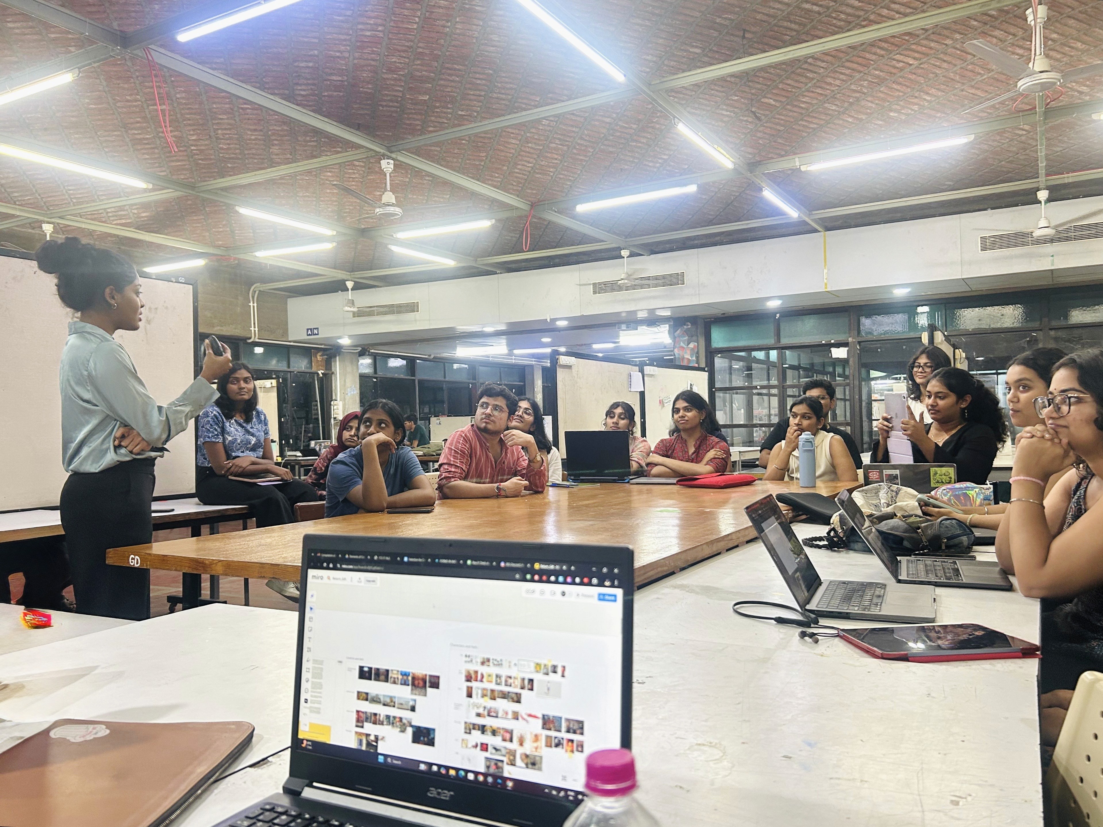
Two years later, in September 2025, I had the privilege of introducing 22 B.Des. Graphic Design students to the world of information design at the National Institute of Design (NID), Ahmedabad.
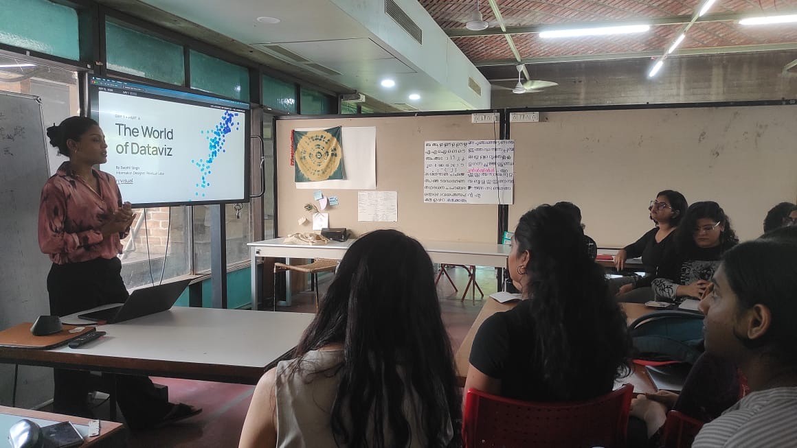
Here are some reflections from two weeks of my time as a visiting faculty:
Graphic design students are predisposed to being good information designers
On day 1, I conducted a short "encoding drawing" session, inspired by one that Gurman once ran at our studio. It presented the students with a very simple dataset:
Number of parental leaves given per year (in days)
Country | Men | Women |
|---|---|---|
Albania | 15 | 60 |
Netherlands | 20 | 90 |
My ask to the students was simple—spend 5 minutes on pen and paper sketching as many ways as they could think of visualising these numbers. Even though the majority of my batch stated that they hadn't worked with, read, or made a lot of charts before, the visualisations they whipped up were incredibly intuitive. Many of them ended up making quintessential charts, unbeknownst to them that these were actual chart types. This was a great litmus test—it let me engage with them over the next few days with a lot more rigour and confidence.
On day 2, after a session on data structures and visual encoding, we attempted a slightly more elevated exercise. The batch was split into groups and they were requested to visualise this dataset by choosing the best possible visual encodings:
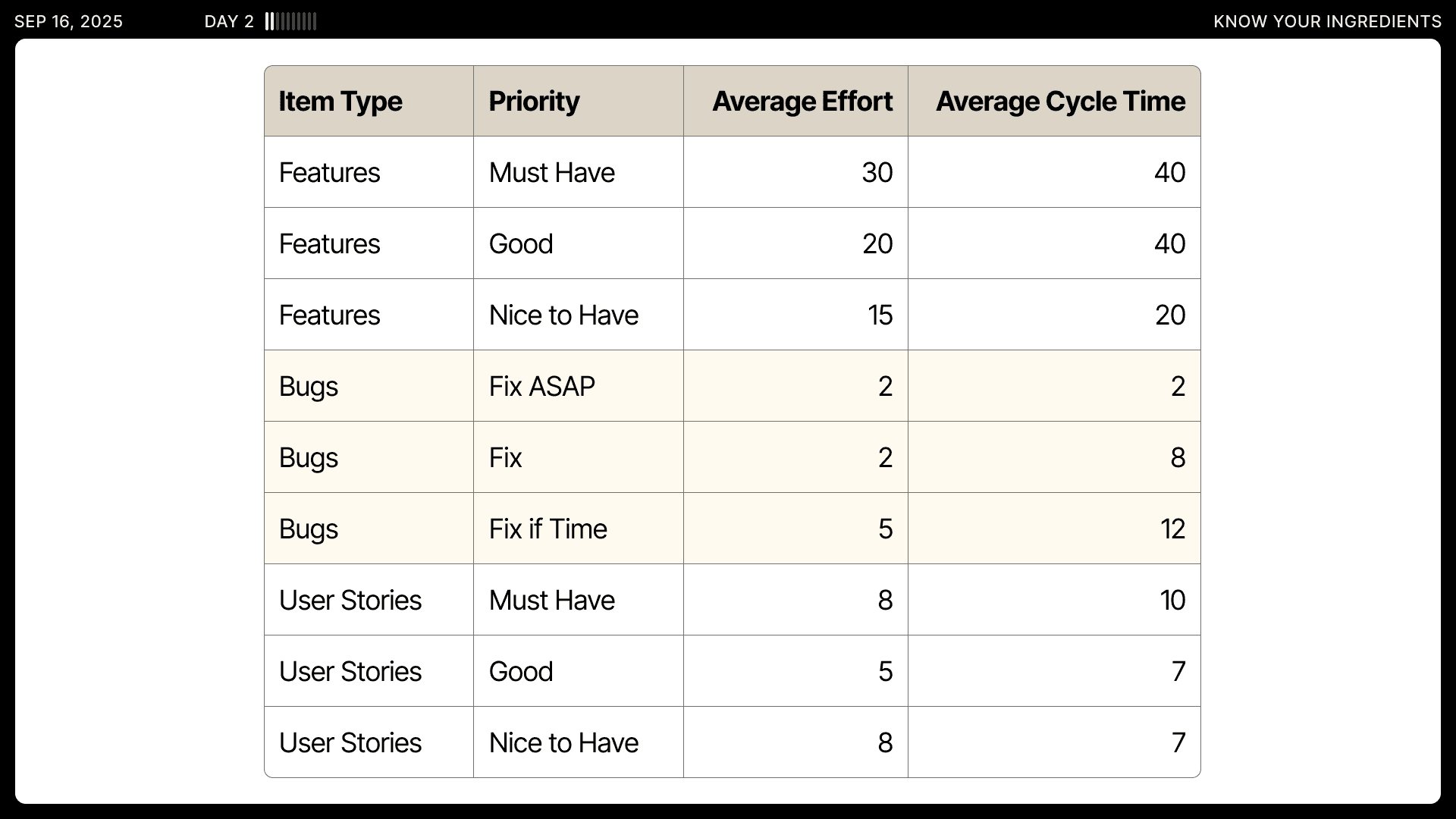
They were requested to not use AI assistance or look up visual references on the internet. Here are some of their outputs at the end of 30 minutes:
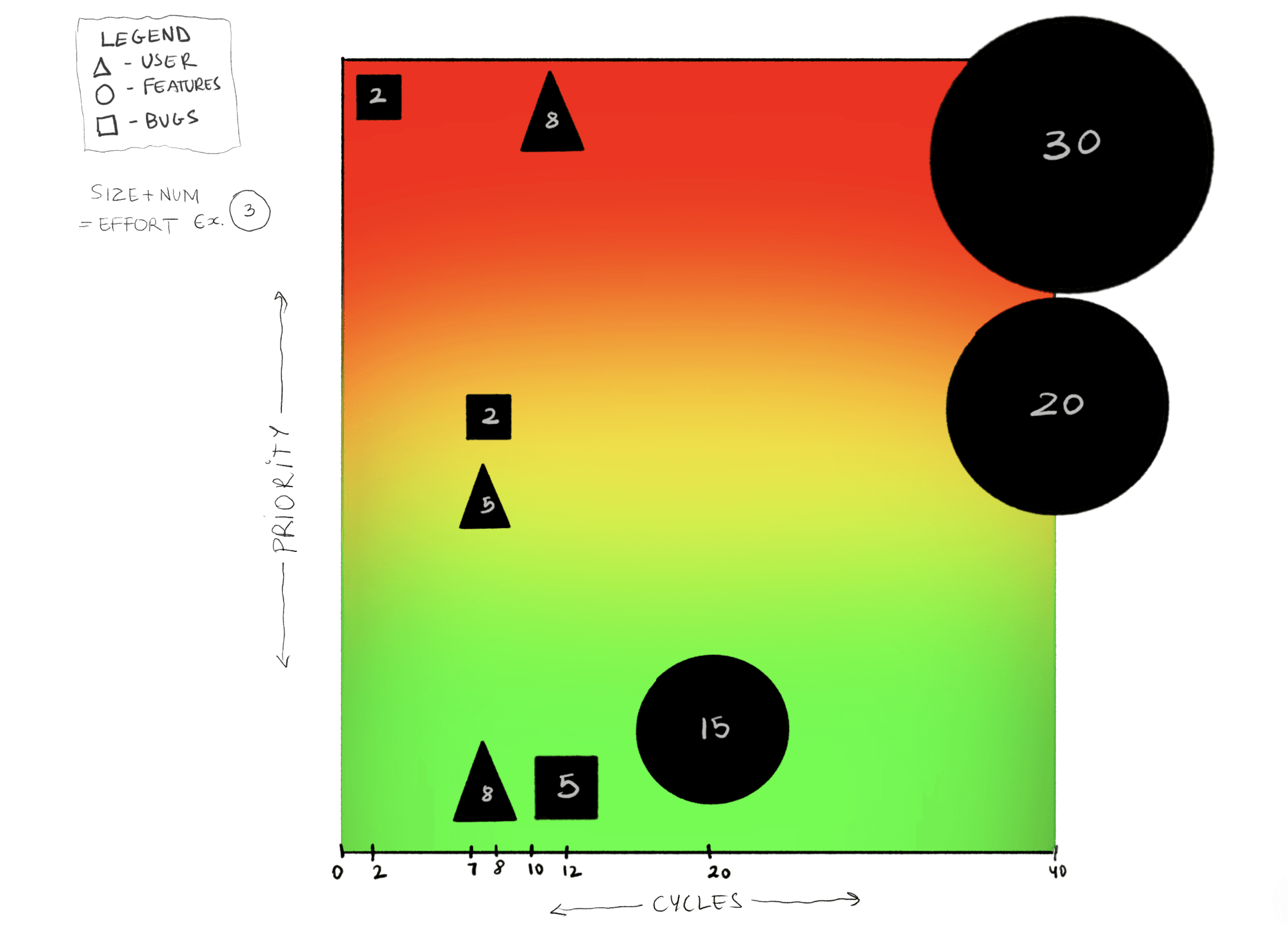
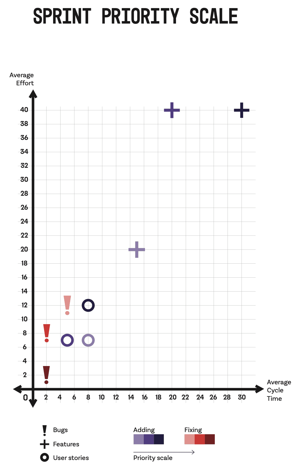
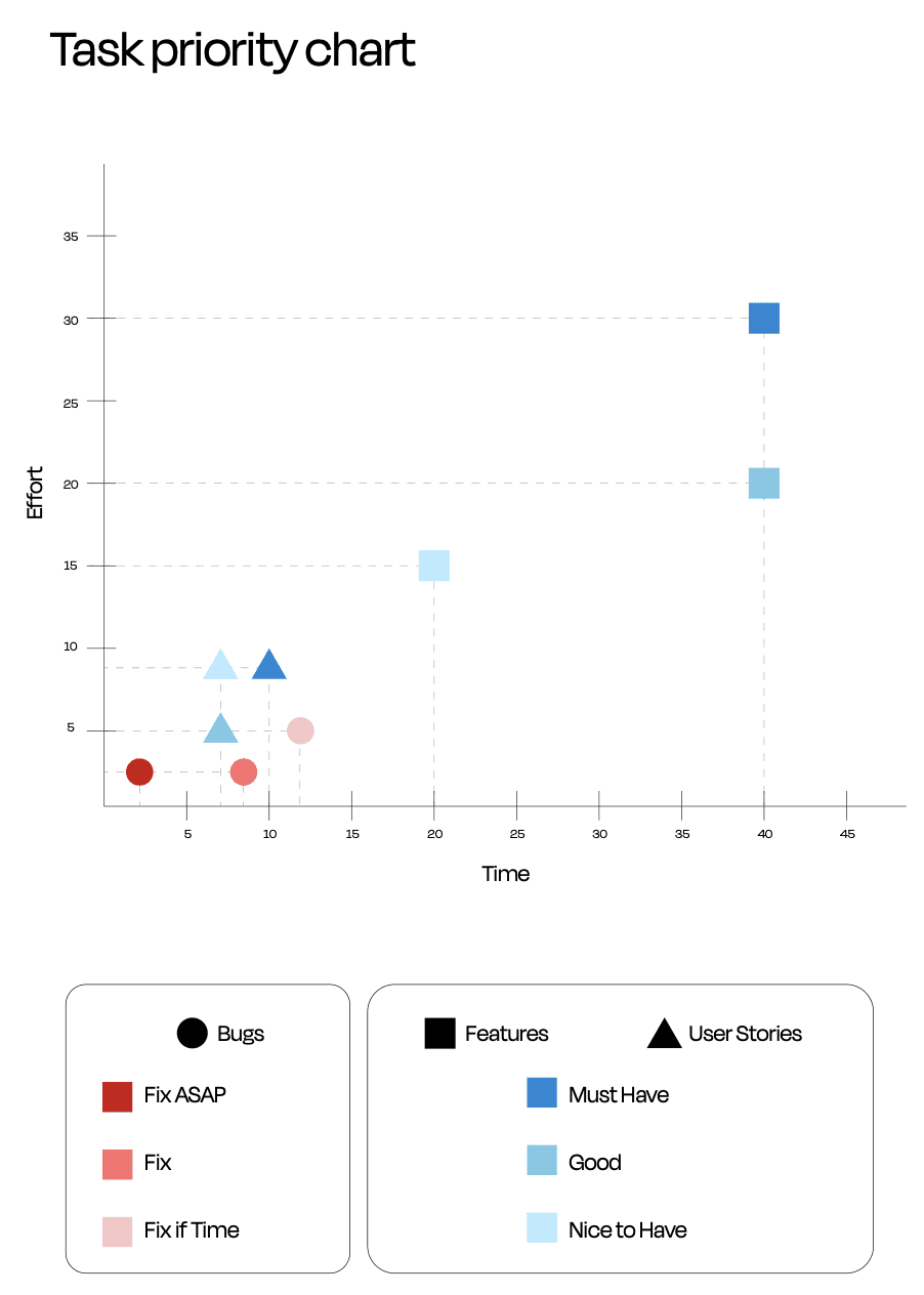
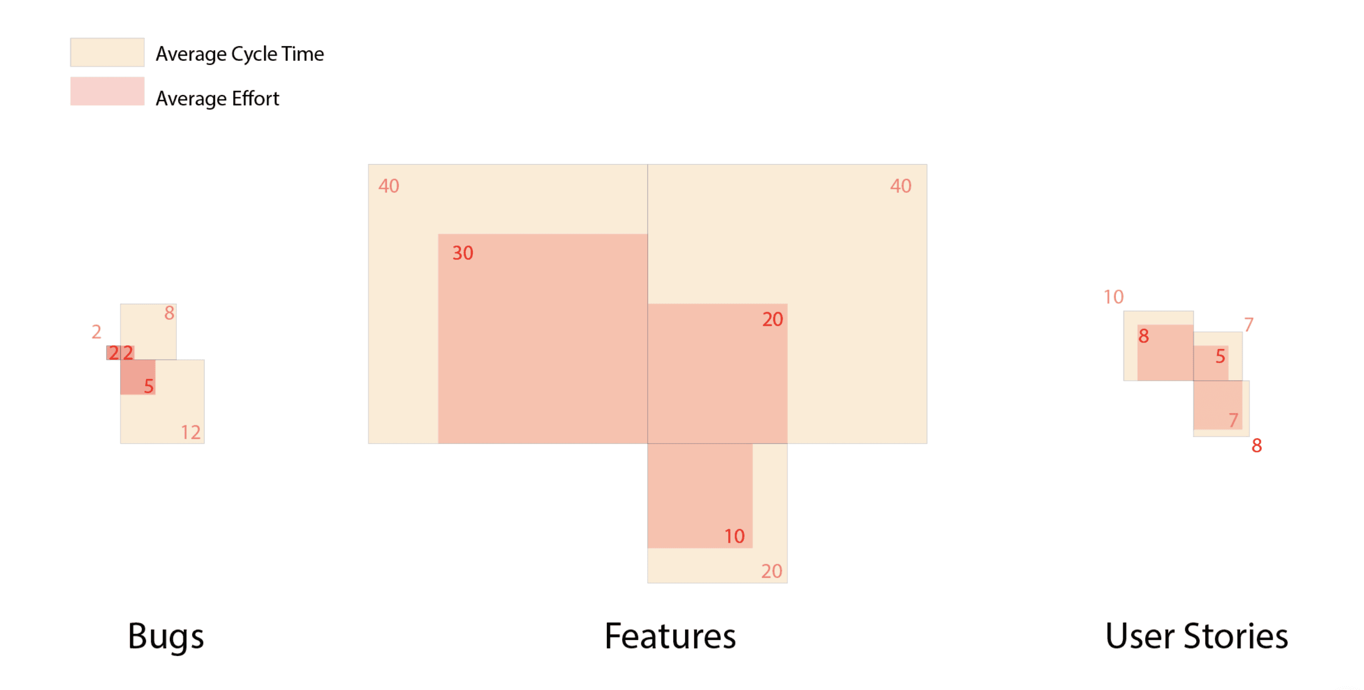
We did a show-and-tell, critiquing all groups' visualisations to understand what worked well, and which redundancies could be eliminated. But overall, they did a fantastic job! As graphic designers, their understanding of space, layout, Gestalt principles, and colour all translate well into information design.
Graphic design students are keen on learning non-design tools as well
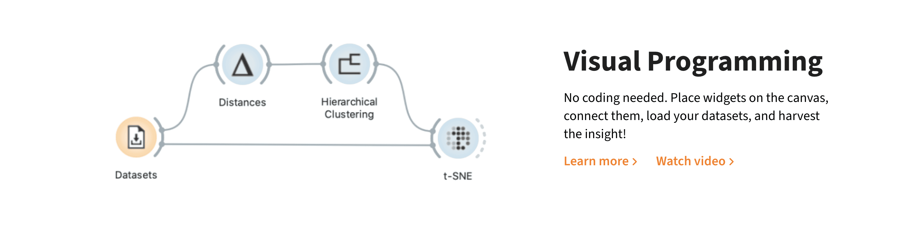
At the recommendation of my incredible colleague Aman Bhargava, I chose to use Orange Data Mining to teach my students how to wrangle data and create summary statistics. Using spreadsheet tools was out of the question—it would've been too difficult to trace their workflows and troubleshoot, given they modify the original dataset and do not document any pipelines. R would've been too complicated given it is a code-based tool, and nor am I an R expert.
Orange bridged these gaps, given it is a visual programming software, it maps out all workflows and pipelines (which would help me troubleshoot), and it does not modify the original dataset, but simply transforms it the workflow.
I could go on and on about the tool (I'm planning on writing a dedicated post soon), but