
A year into Revisual Labs' existence (circa Aug 2024), our agency's founder (and my colleague) Gurman Bhatia sent me a link to Kuhu Gupta's talk at Outlier 2024. Kuhu walks us through the concept of micro-visualisations—tiny data visualisations that pack a punch when it comes to conveying and contextualising information. I remember taking stock of all the micro-visualisations we'd made for our projects until then (albeit unaware of this moniker), and resolving to create more for our future projects.
Fast-forward to Feb 2025, and I got to present a talk at UX Now about micro-visualisations, microcopy, and their relevance to UX designers (primarily in the digital product design context). Although this time, my deck almost exclusively showcased examples from a range of projects by me and my team at Revisual Labs. This is something that made Gurman and I incredibly happy, since we tend to use a fair share of external examples in talks and training engagements—but this time, they were mostly ours.
When invited to speak at the conference, I chose this topic because while UX design is a key pillar of any digital information design product (be it a data story or a dashboard), the reverse can rarely be proclaimed.
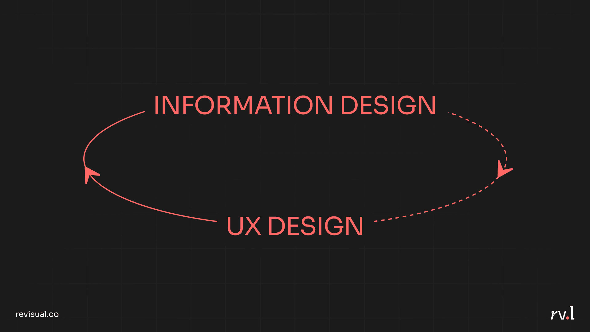
However, I truly believe that information design can confer SO much value to UX designers by helping them shape how people see and process information. Here are some excerpts from my talk:
Part I: Microcopy
Yes, it's Data 'Visualisation', but…
People may forget numbers, but they always remember stories. As much a chart's data and visual design matters, it will seldom work if the insight is not communicated well. In most cases, the chart should, on its own, tell the story.
This is where an insightful chart title, a "boring technical research paper subheading", annotations, and clear labels matter. For example, let's look at this simple chart from our data story for UNHCR:
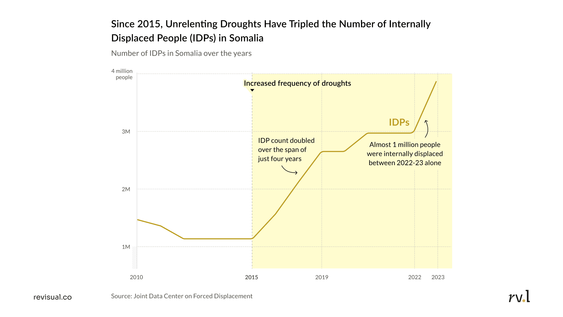
The chart has been architected to have X- and Y-axis labels, tick marks corresponding to the most significant years, annotations that spell out important trends and external causalities, and an insightful chart title. The title is our first and most important point of interaction with a reader—it hooks them by providing an overarching insight, which can then prompt them to examine further nuances of the chart. The "multimedia effect" hypothesises that people learn better from a combination of words + visuals, rather than either alone.
Copy is a design element; not an afterthought
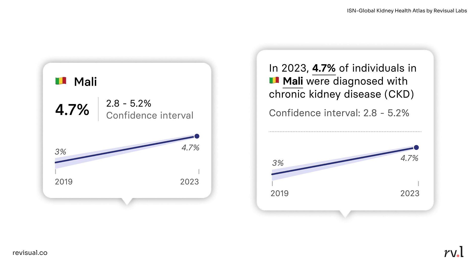
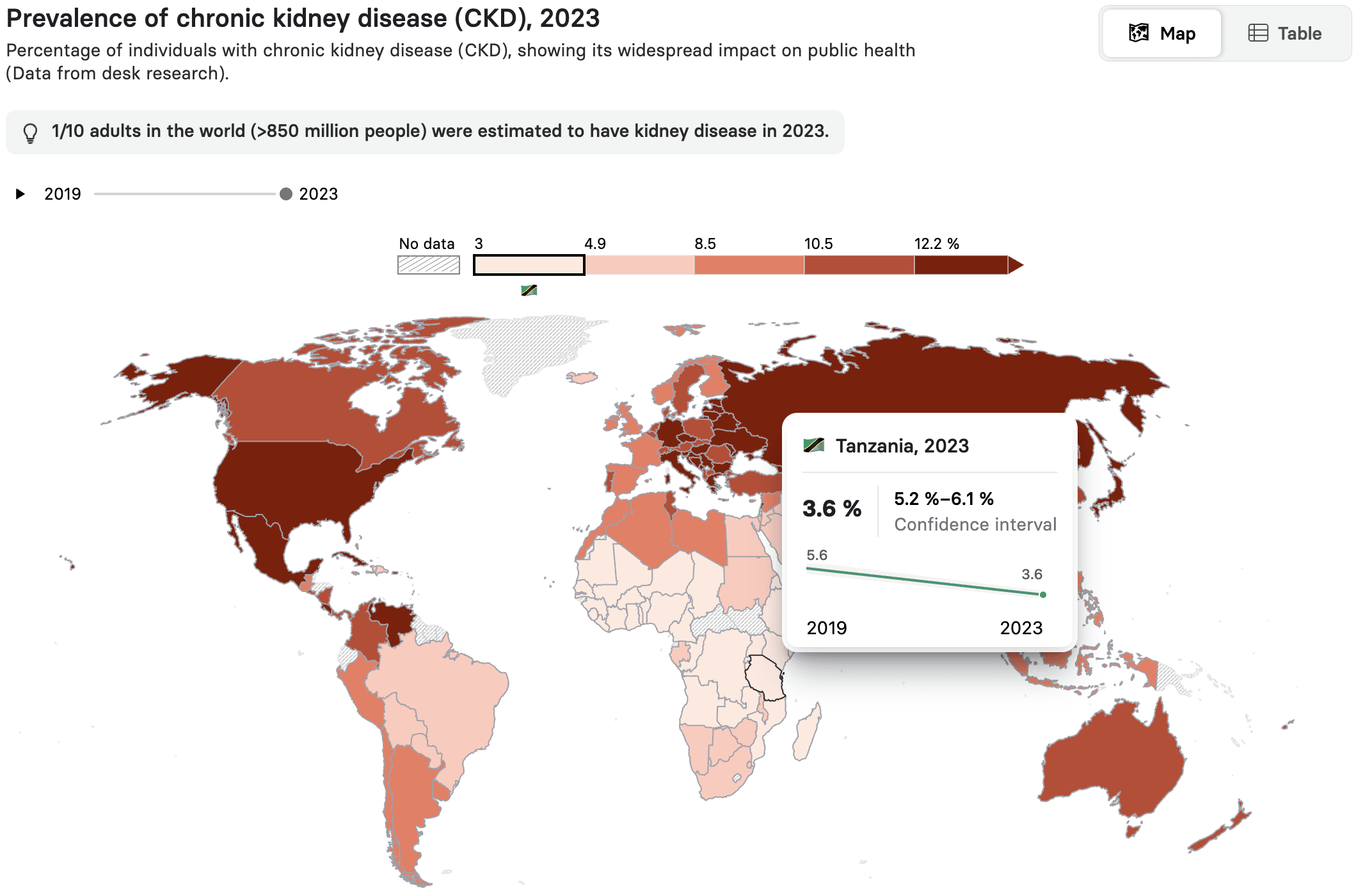
Tooltips, modals, alerts—these are small UI elements, but their microcopy is just as important as their visual design. Take tooltips, for example. It is common practice to display data simply as numerical values (e.g., the tooltip to the left in the image above, from our ISN-Global Kidney Health Atlas). But what if it spoke to the reader and not at them? The tooltip to the right does just that. By narrating the metric instead, it reinforces the year, its technicality (% of individuals), and the indicator the user is examining (chronic kidney disease). There is potential to create better user experiences even within the smallest of components.
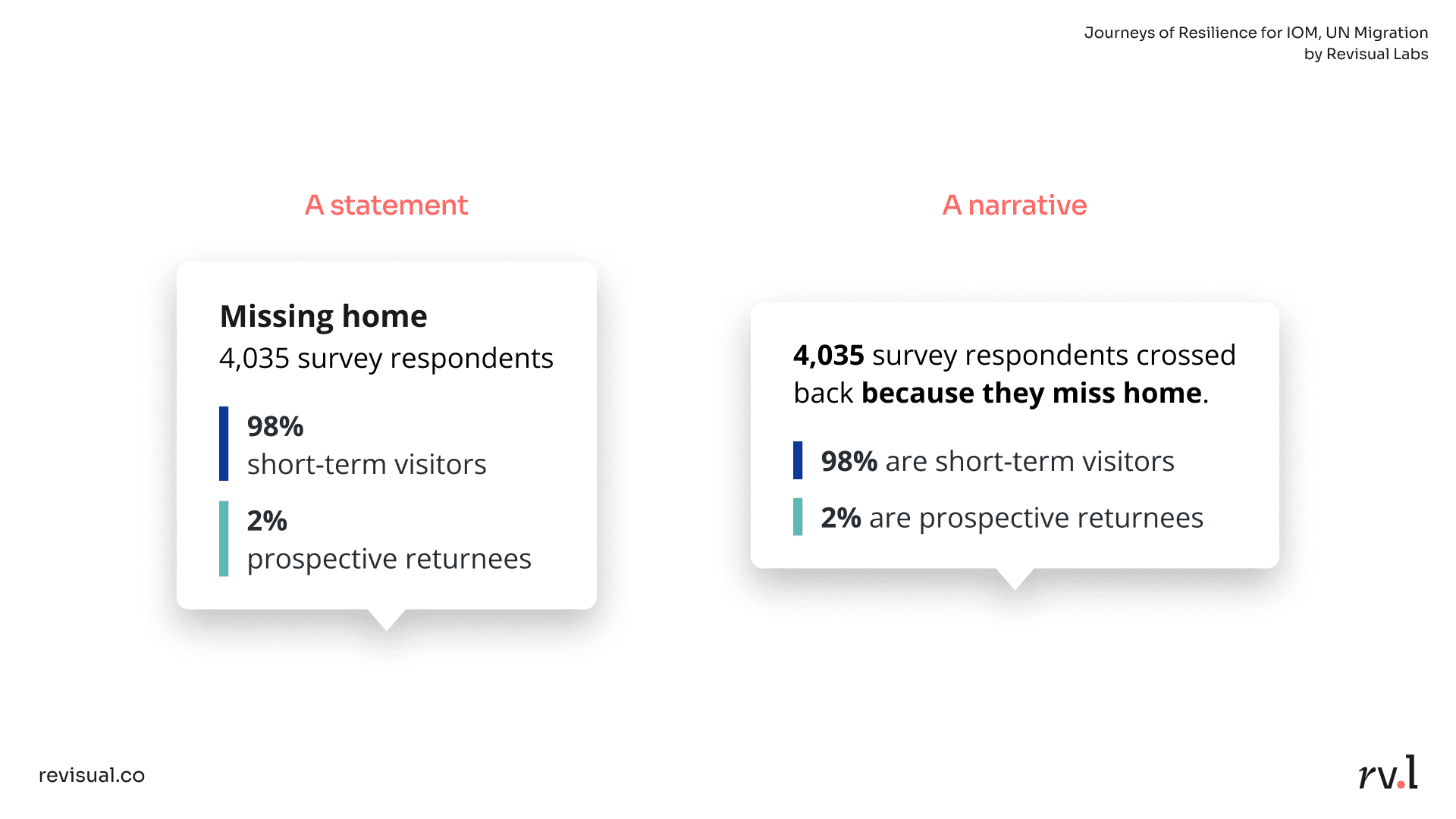
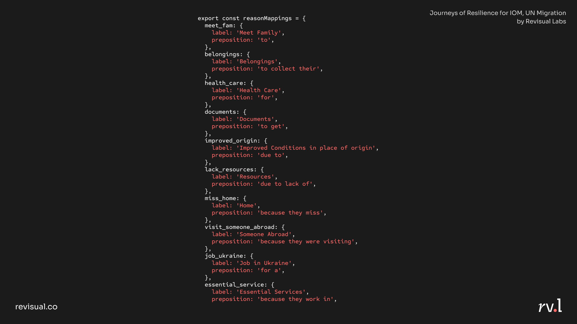
Another example is this Marimekko from our story Journeys of Resilience, for IOM-UN Migration:
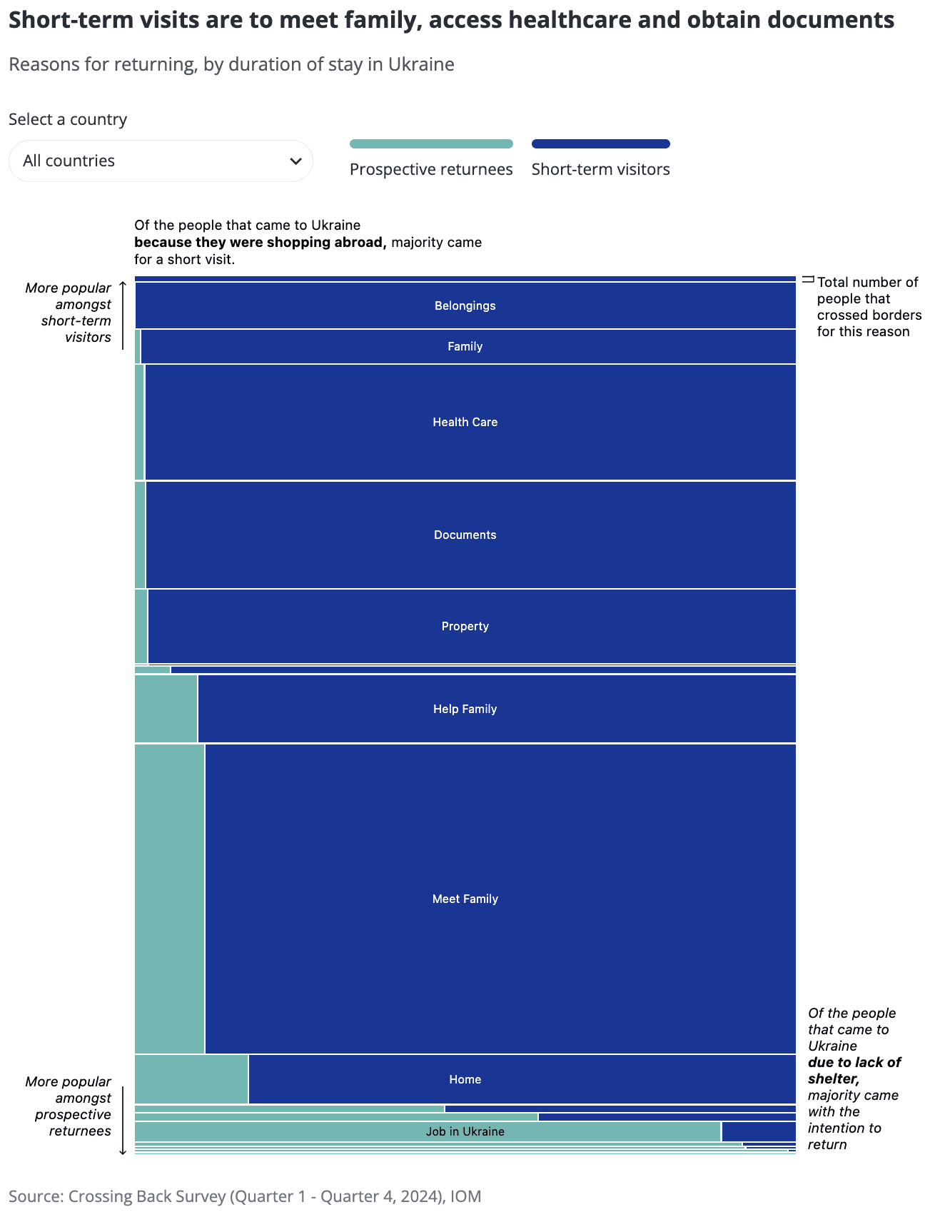
We were working with a large, dynamic dataset that lets the story be updated seamlessly in the future, without developer intervention. The blunt labels in the raw dataset ("Missing home", "Meet family", "Belongings", "Documents", etc.) were coded with appropriate prepositions to render their tooltips more narrative in their tone:
Code snippet for the tooltips:
As much as our work as designers is largely visual, words are key to creating experiences that work.
I concluded the segment on microcopy by suggested some thoughts UX designers can keep in mind:

Part II: Micro-visualisations
Micro-visualisations are tiny visualisations or graphics that can improve user experience by presenting information in easily digestible ways. They provide bite-sized insights from larger sets of data, and are compact, embeddable, versatile, and intuitive. Most notably, they are not standalone visualisations, but part of a larger interface. This makes them a valuable addition to any UX designer's arsenal.
Let's go through a few examples:
Depict change over time
In this bubble map in our dashboard for IOM, we see the total number of crossings made by refugees from Ukraine to neighbouring countries amid the Russo-Ukrainian war. But then, a micro-visualisation appears on hover: an area chart, providing historical context for the same number. Being able to see change over time helps us observe larger patterns. We can see a significant bump in Feb '22, which can be attributed to Russia's full-scale invasion of Ukraine. We can also note a few more spikes after, which can nudge users to probe further into causality.
Similarly, in our ISN-Global Kidney Health Atlas, a slope chart embedded in the tooltip depicts the trend between two survey years.
Such micro-visualisations can be of significant value in domains such as fintech products.
Enable easy comparison
The "multimedia effect" hypothesises that people can learn more deeply from a combination of words and visuals together than either alone. This is why visualisation matters, for we cannot process a number entirely unless it conjures up a pictorial representation in our mind.
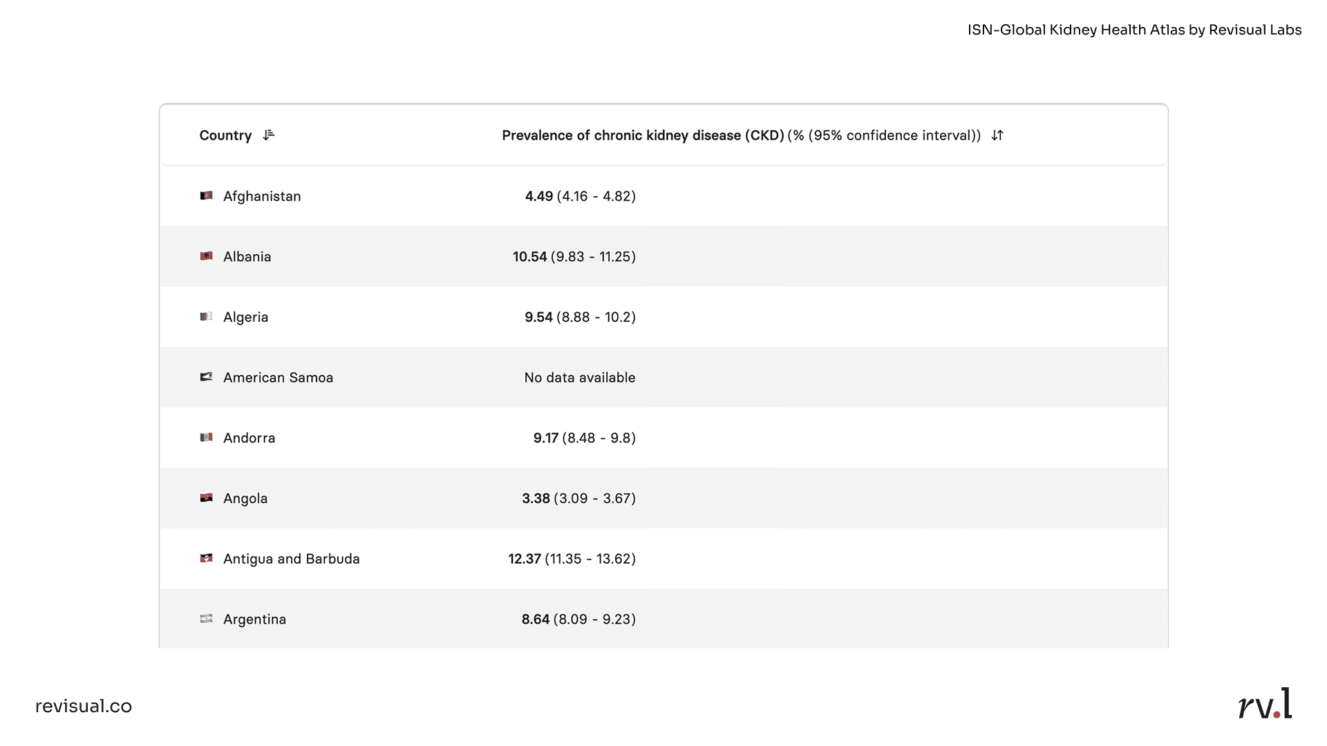
Take tables, for example. We can barely perceive differences in value here:
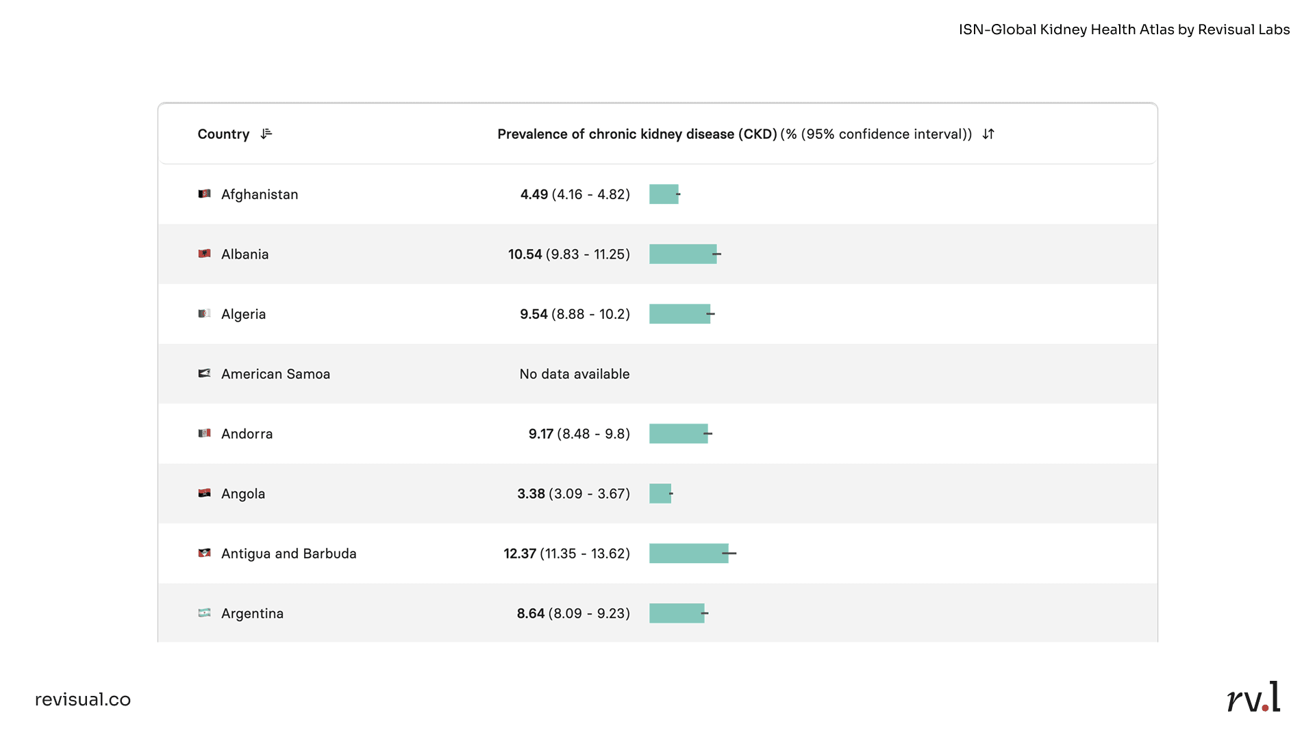
Now, embed inline bars, and we are instantly able to compare values without much cognitive strain:
Aid in benchmarking
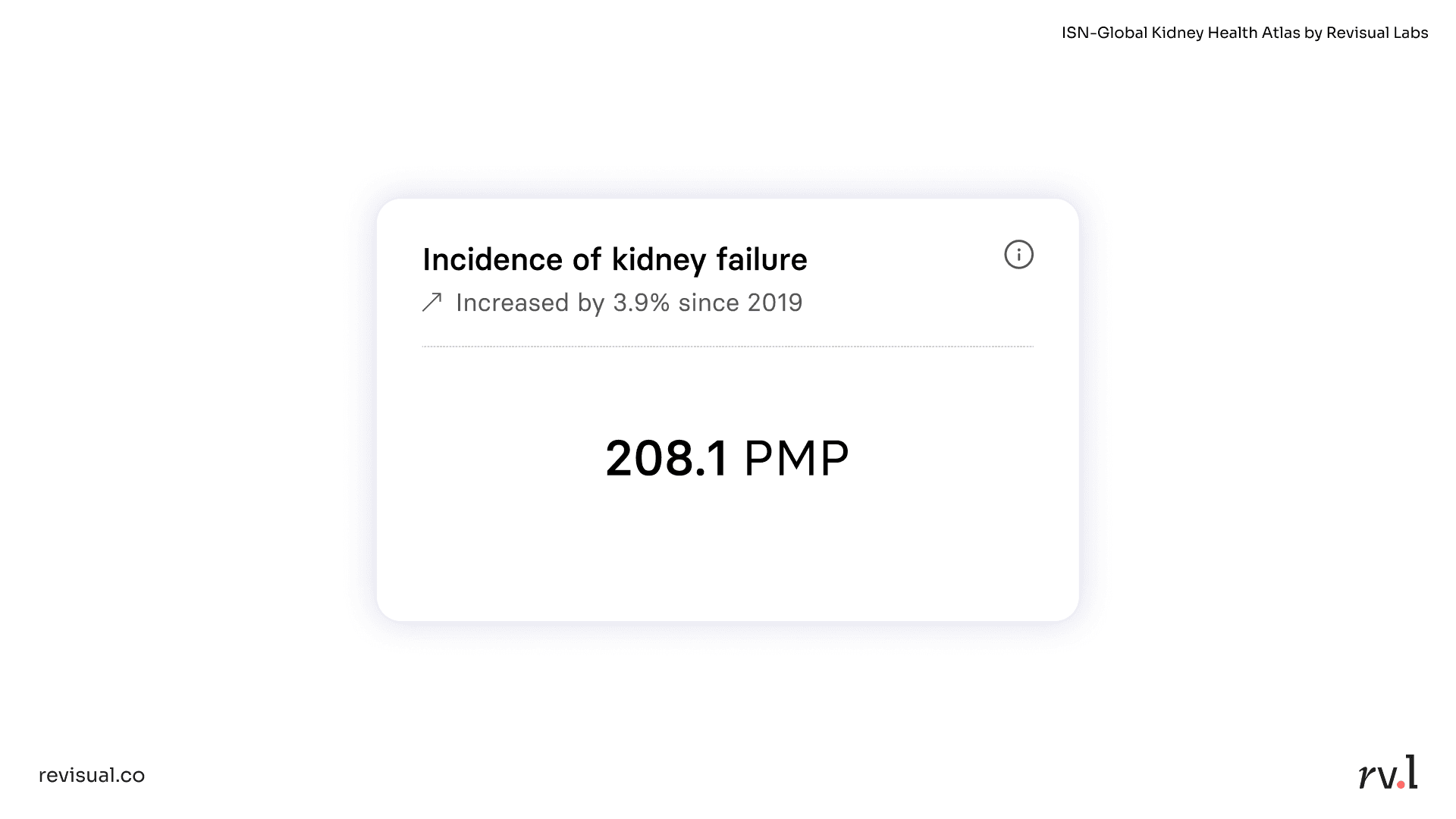
Another use case of micro-visualisations is benchmarking. In our ISN-Global Kidney Health Atlas, there is a separate view that lists data for kidney health indicators by country. Which means that for a randomly drawn country—in this case, Canada—you might conventionally just depict the value of an indicator like so:
However, our user research indicated that users frequently pit countries (as well as income groups) against one another during their research. To aid in such benchmarking, we embedded a "barcode plot" within each indicator card:
Thanks to positional distribution, we are able to see the entire range of possible values (min, max) and clustering (where most countries lie). A dotted line depicts the global median, which Canada (208.1 per million population) is close to, and we can see significant outliers such as Taiwan and Mexico.
This micro-visualisation is just one of many indicator cards displayed per country, World Bank Income Group, or ISN Region:
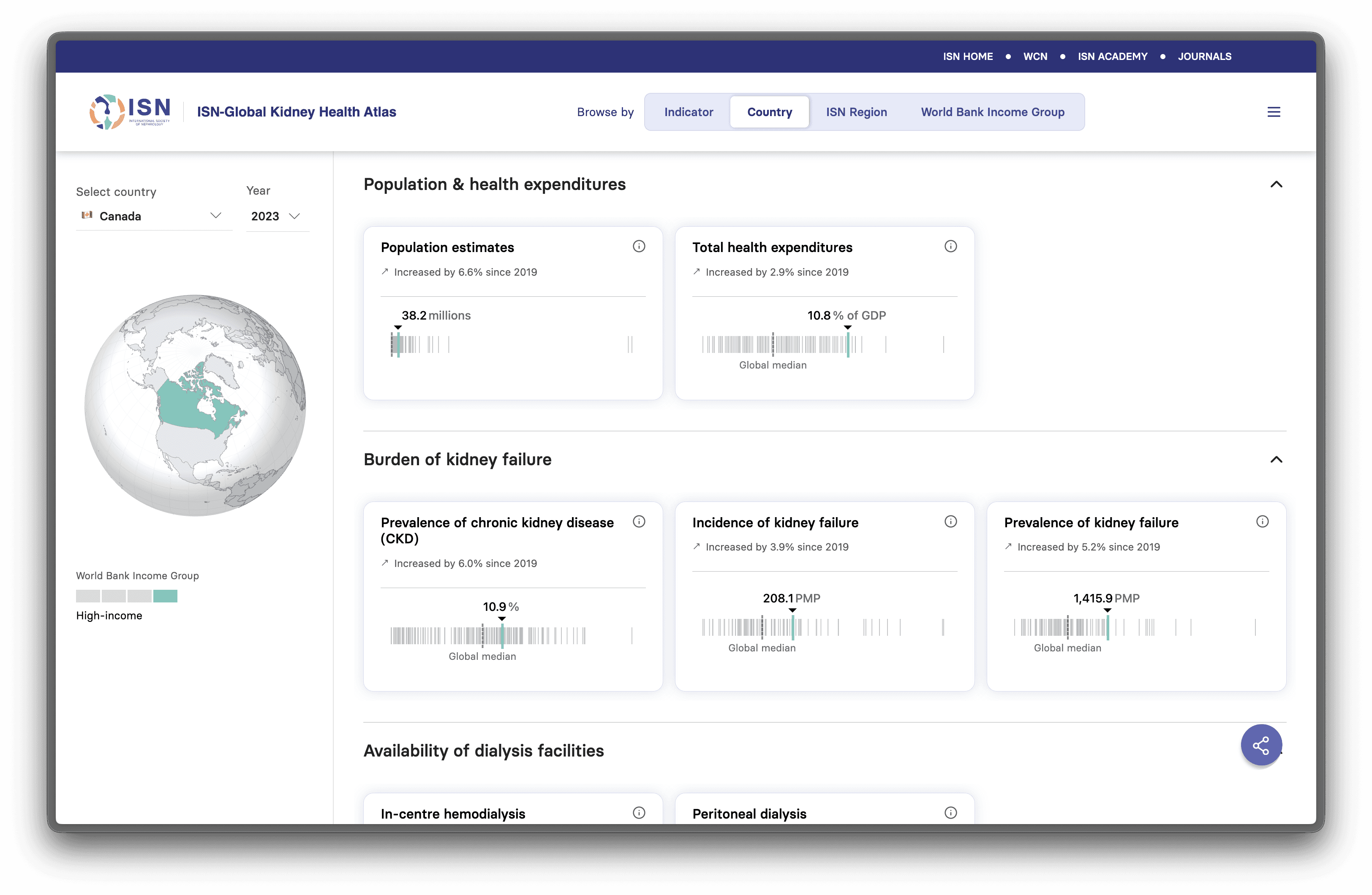
This helps users benchmark and compare without having to open multiple tabs, take notes, or download CSVs to compute further.
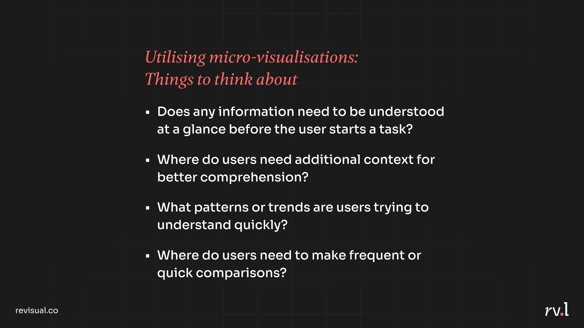
Micro-visualisations reduce cognitive load, help users visually perceive values or progress, provide larger overviews in smaller areas, and orient users before they make important decisions. I closed this segment of the talk by encouraging UX designers to consider the following questions while designing interfaces:
Information Design 🤝 UX Design
These are just two of many aspects in the world of information design that can be of value to UX designers' practice. I truly believe that more digital products have room to benefit from thoughtful visual aids that effectively communicate information, and that information design as a field should be just as mainstream.
🔗 Link to my full talk deck
Gratitude:
I'd like to thank my team at Revisual Labs for helping me streamline my talk (I had WAY TOO MUCH I wanted to talk about for a 15-minute slot), Gurman Bhatia for saying my name in a room full of opportunities, and the UX Now team for hosting me as a speaker.